
どうも、べ〜やんです。
今回は、複数のレスポンシブを同時に確認できるChromeの拡張機能『ResponsiveViewer』を紹介します。

目次
ResponsiveViewerとは
ResponsiveViewertとは無料で使用できる2019年11月18日にリリースされたばかりの新しいChromeの拡張機能です。
複数のデバイスでどのように表示されているのかを同時に確認できる機能です。
ResponsiveViewert-Chromeウェブストア
使い方
ResponsiveViewertはChromeの拡張機能なので、Chromeを使用してください。
ChromeウェブストアにアクセスしてResponsiveViewertを追加します。
ResponsiveViewert-Chromeウェブストア
確認したいページにChromeでアクセスして、ResponsiveViewertのアイコンをクリック。
サイドバーから確認したいデバイスを選択。右上の『+』マークから任意のサイズを指定しることもできます。
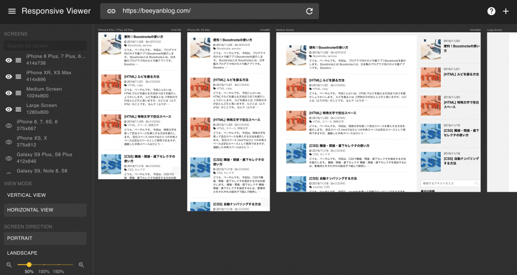
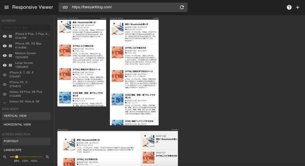
縦向きと横向きの確認が可能。
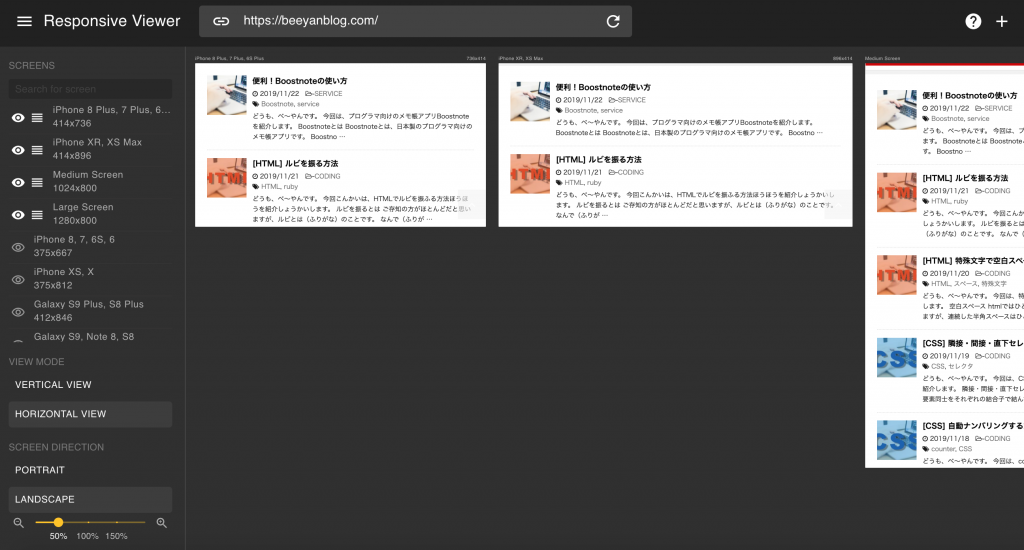
縦並びと横並びが選択可能。
おわりに
今回は、複数のレスポンシブを同時に確認できるChromeの拡張機能『ResponsiveViewer』を紹介しました。
最近は、デバイスのサイズも多様になってきたので複数のサイズを同時に確認できるのはありがたいですね。