
どうも、べ〜やんです。
今回は、CSSで要素を横並びにする方法のflexboxの基本的な使い方を紹介します。
目次
flexboxとは?
要素を横並びに配置する方法のひとつに、flexboxがあります。
flexboxはCSS3から導入されたものです。なのでそれ以前からある方法のfloatとは別のものですので混同しないように注意してください。
HTMLでは基本的に要素は縦並びに配置されますが、flexboxを使って横並びにできます。
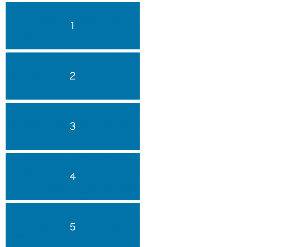
↓
flexboxの書き方
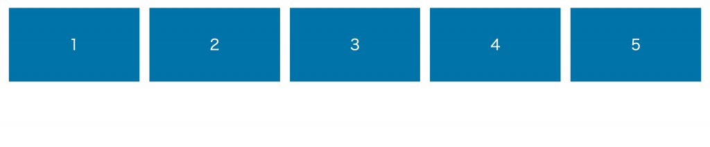
flexboxを使うには、まずHTMLで親要素と子要素を作ります。
親要素(container)のなかに子要素(item)を作り、親要素のCSSにdisplay:flex;を与えます。
横並びにしたいのは子要素の部分ですが、flexを与えるのは親要素ですので間違えないように注意してください。
<div class="flex-container">  <!-- 親要素 -->
  <div class="flex-item">1</div> <!-- 子要素 -->
</div>
.flex-container {
display: flex;
}
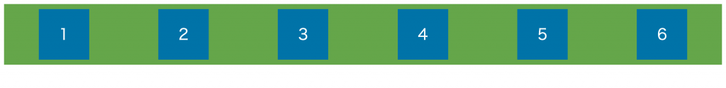
.flex-item {
}これで左から右の順で横並びになるので、あとはCSSで細かい調整をするだけです。
ここでは左から右の順で横並びになっていますが、その他のレイアウトもできるので紹介します。
flexboxの種類 (親要素)
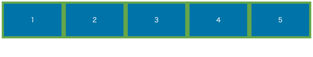
並び順 flex-direction
flex-directionプロパティを使って並び順を変更できます。
左から右 row(デフォルト)
水平方向に左から右の順に並ぶ。
.flex-container {
display: flex;
flex-direction: row;
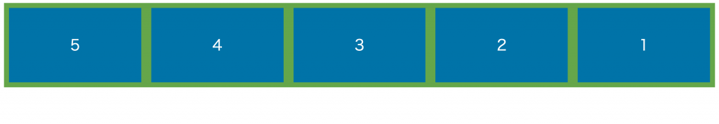
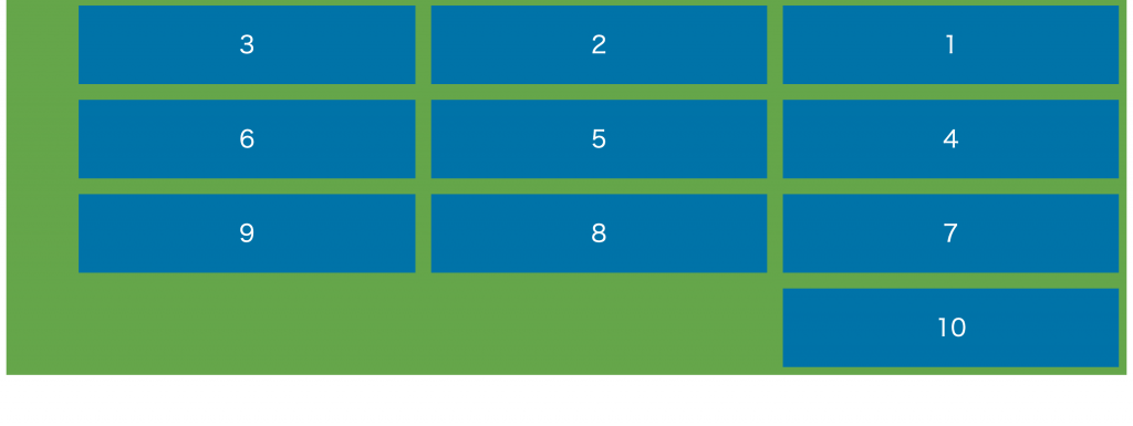
}右から左 row-reverse
水平方向に右から左に並ぶ。
.flex-container {
  display: flex;
  flex-direction: row-reverse;
}
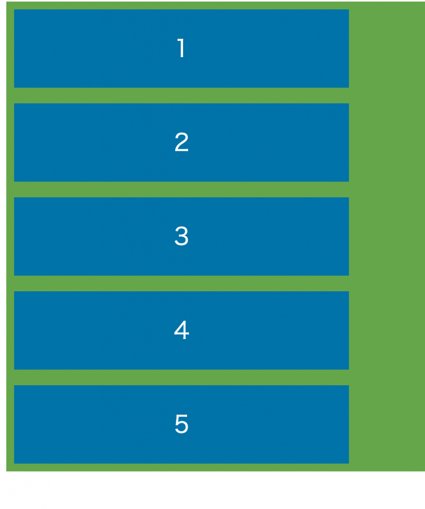
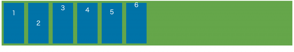
上から下 column
垂直方向に上から下に並ぶ。
.flex-container {
  display: flex;
  flex-direction: column;
}
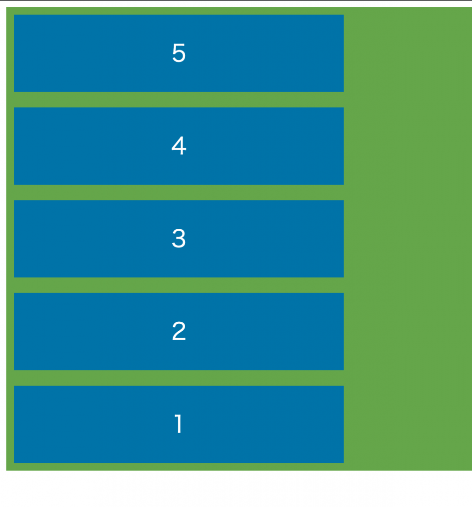
下から上 column
垂直方向に下から上に並ぶ。
.flex-container {
  display: flex;
  flex-direction: column-reverse;
}
折り返し flex-wrap
flex-wrapプロパティを使って、横幅いっぱいになったとき折り返しをどうするかを指定できます。
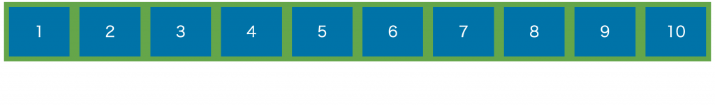
折り返しなし nowrap
折り返しなし。
.flex-container {
  display: flex;
  flex-wrap: nowrap;
}
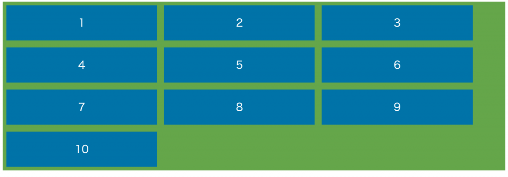
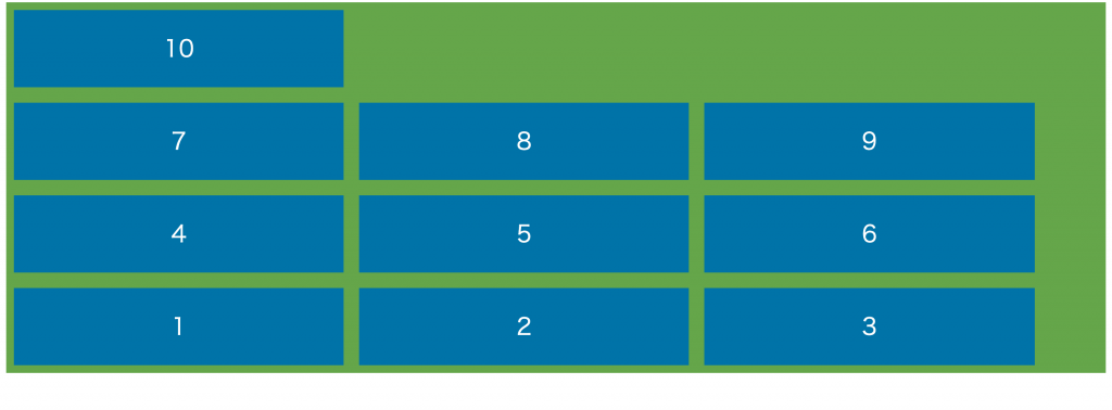
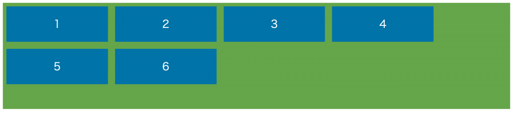
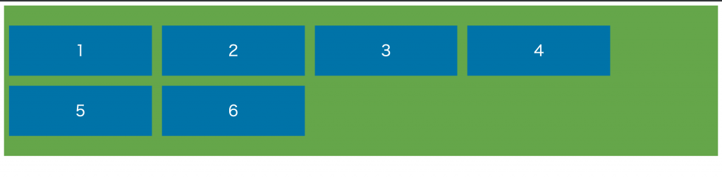
折り返して上から下 wrap
折り返して上から下に行を作る。
.flex-container {
  display: flex;
  flex-wrap: wrap;
}
折り返して下から上 wrap-reverse
折り返して下から上に行を作る。
.flex-container {
  display: flex;
  flex-wrap: wrap-reverse;
}
並びと折り返しを一括指定 flex-flow
flex-flowを使って並び順と折り返しの指定を一箇所でできます。
flex-flow: 並び順 折り返し; で指定します。
.flex-container {
  display: flex;
  flex-flow: row-reverse wrap;
}
水平方向の位置指定 justify-content
justify-contentaプロパティを使って、アイテムの右揃えや中央揃えなど水平位置指定ができます。
左揃え flex-start
アイテムを左揃えで配置。
.flex-container {
  display: flex;
  justify-content: flex-start;
}
右揃え flex-end
アイテムを右揃えで配置。
.flex-container {
  display: flex;
  justify-content: flex-end;
}
中央揃え center
アイテムを中央揃えで配置。
.flex-container {
  display: flex;
  justify-content: center;
}
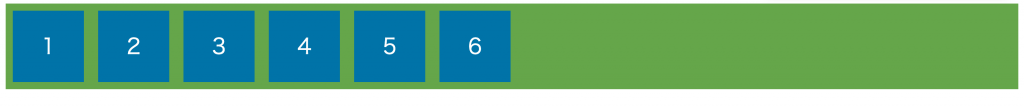
均等配置 space-between
アイテムを横幅いっぱいに均等に配置。
.flex-container {
  display: flex;
  justify-content: space-between;
}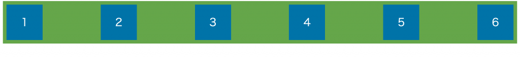
均等配置 space-around
アイテムを均等に配置。
.flex-container {
  display: flex;
  justify-content: space-around;
}
垂直方向の位置指定 align-items
align-itemsプロパティを使って垂直方向の位置指定ができます。
子要素にheight: 100px;など絶対値を指定しているとうまく動作しないものもあるので、min-height: 100px;(最小で100px)などと指定してみてください。
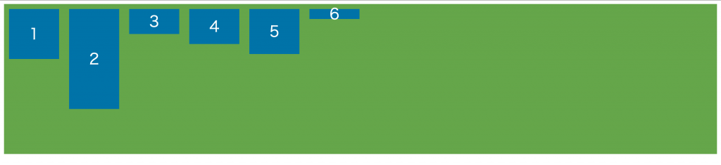
上揃え flex-start
上に揃えて配置。
.flex-container {
  display: flex;
  align-items: flex-start;
}
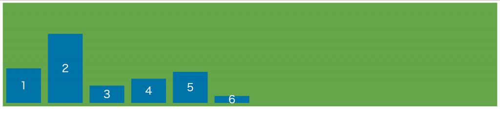
下揃え flex-end
下に揃えて配置。
.flex-container {
  display: flex;
  align-items: flex-end;
}
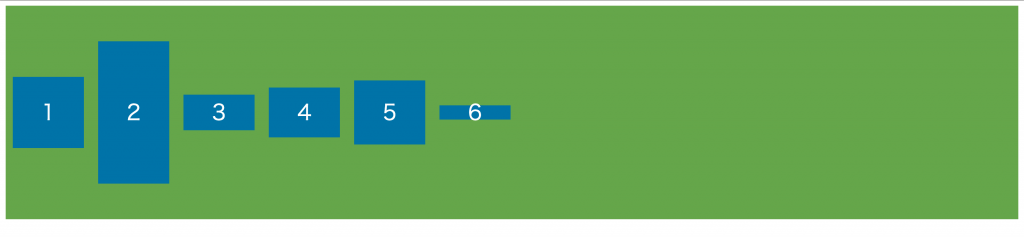
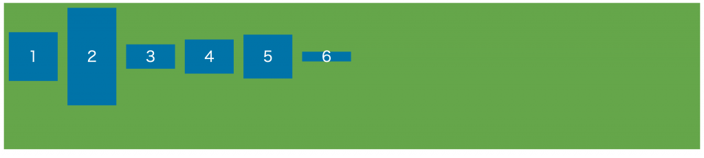
中央揃え center
中央に揃えて配置。
.flex-container {
  display: flex;
  align-items: center;
}
ベースライン揃え baseline
ベースラインに揃えて配置。
.flex-container {
  display: flex;
  align-items: baseline;
}
縦の余白を埋めるように stretch
縦の余白を埋めるように配置。
.flex-container {
  display: flex;
  align-items: stretch;
}
二行以上の垂直配置 align-content
align-contentプロパティで複数行のときの垂直配置を指定ができます。
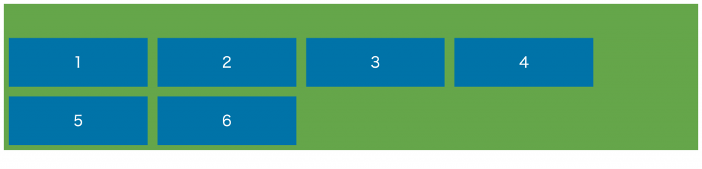
上揃え flex-start
上に揃えて配置。
.flex-container {
  display: flex;
  align-content: flex-start;
}
下揃え flex-end
下に揃えて配置。
.flex-container {
  display: flex;
  align-content: flex-end;
}
中央揃え center
中央に揃えて配置。
.flex-container {
  display: flex;
  align-content: center;
}
均等配置 space-between
行を縦幅いっぱいに均等に配置。
.flex-container {
  display: flex;
  align-content: space-between;
}
均等配置 space-around
行を均等に配置。
.flex-container {
  display: flex;
  align-content: space-around;
}
縦の余白を埋めるように stretch
縦の余白を埋めるように配置。
.flex-container {
  display: flex;
  align-content: stretch;
}
おわりに
今回は、flexboxの基本的な使い方について紹介しました。
この他にも、子要素にさまざまな設定をしてレイアウトができます。
別の機会に子要素側の紹介もします。